
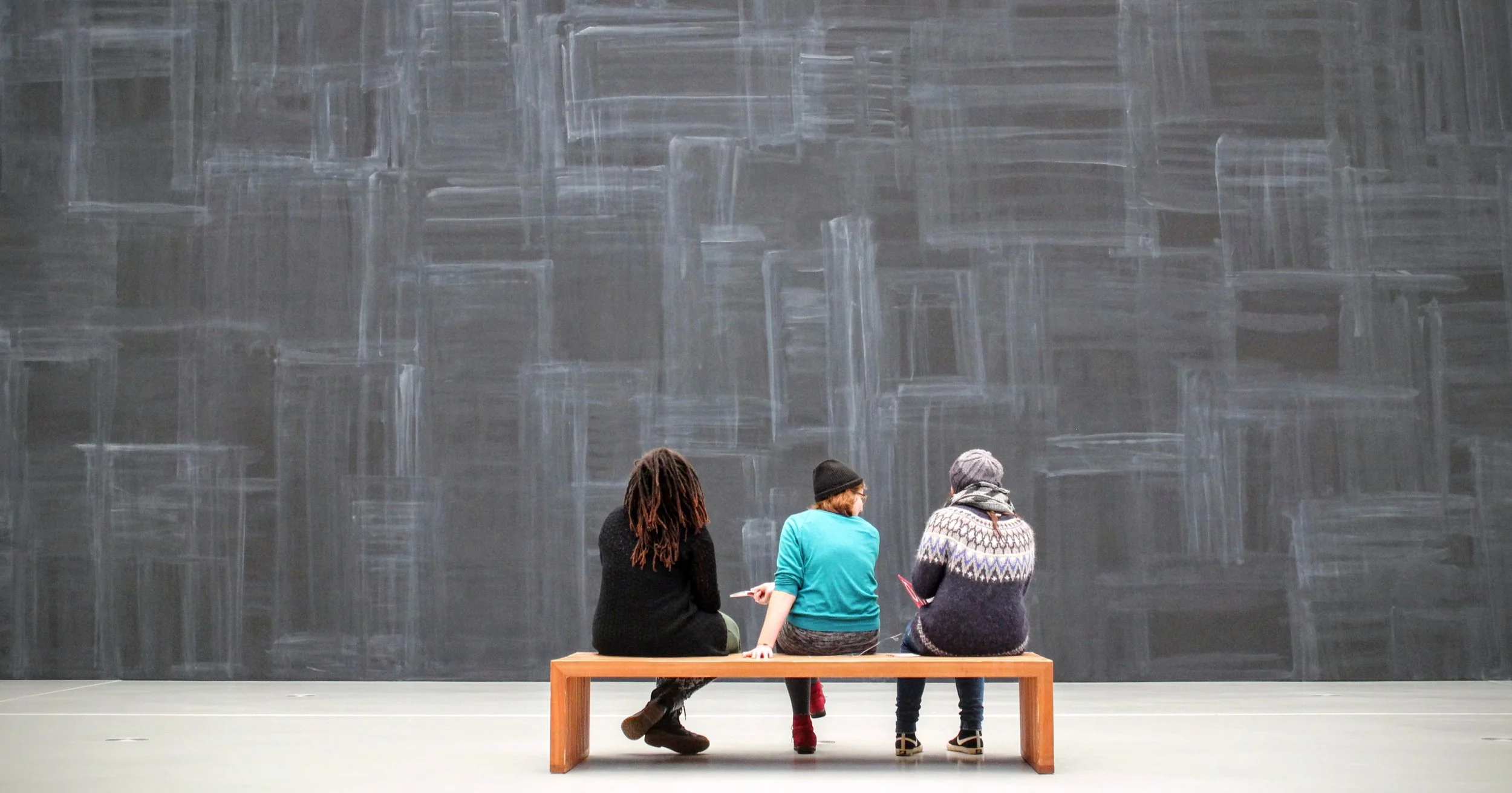
Cappadocia Art Museum
UX Research | UX Design
Introduction
This project involves designing an app for a fictional public art museum as part of the Start the UX Design Process: Empathize, Define, and Ideate course. Based on user research, the app is designed for frequent museum visitors to explore exhibitions and events, access detailed information, purchase tickets in advance, and plan individual or group visits efficiently.
Research
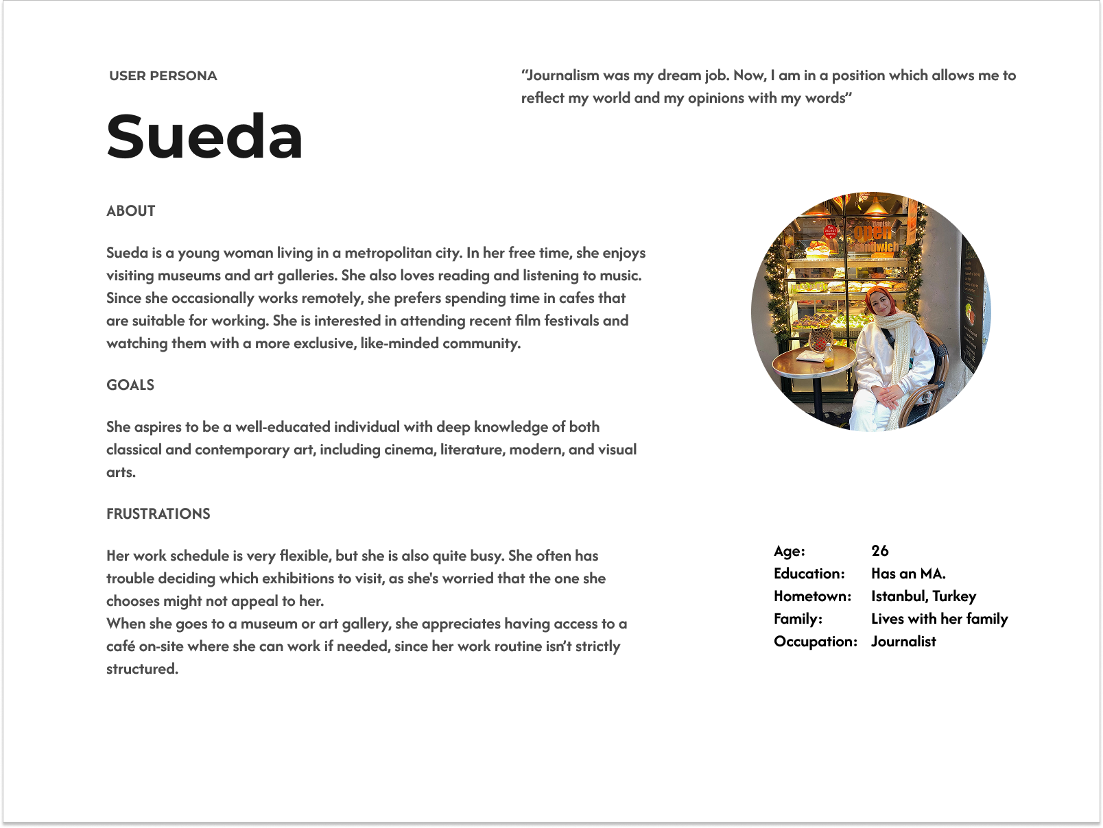
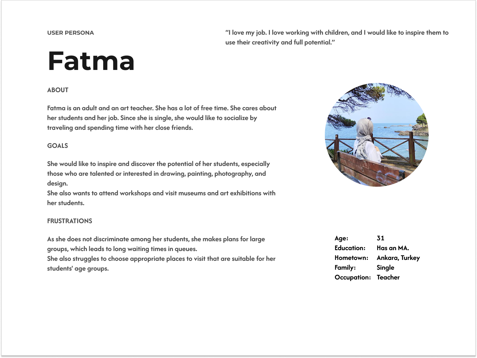
User research was conducted through interviews to understand the challenges museum visitors face. The insights were analyzed to identify recurring patterns and key pain points, which informed the creation of user personas. Major pain points included:
Limited access to exhibition and event information
Unclear dates
Difficulty purchasing tickets in advance
Long entrance queues
Lack of support for organizing group visits.
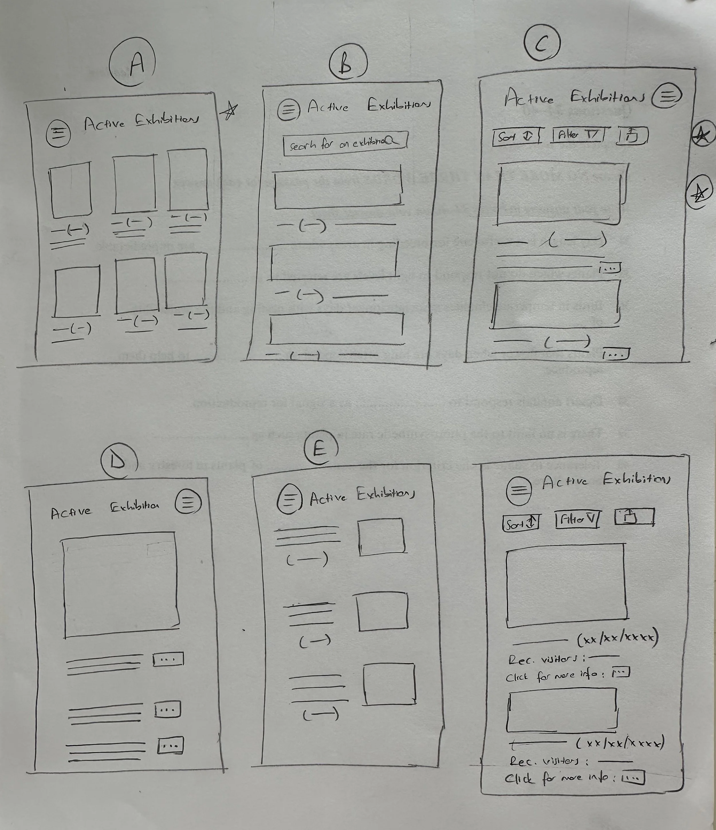
Exploring Ideas and Sketches
I began my process by brainstorming ideas and utilizing paper frames. Starting with user journeys and flows allowed me to gain clarity on the users' mindsets and behaviors. To validate my initial concepts and ideas, I created paper sketches and wireframes, iterating and refining them as necessary.
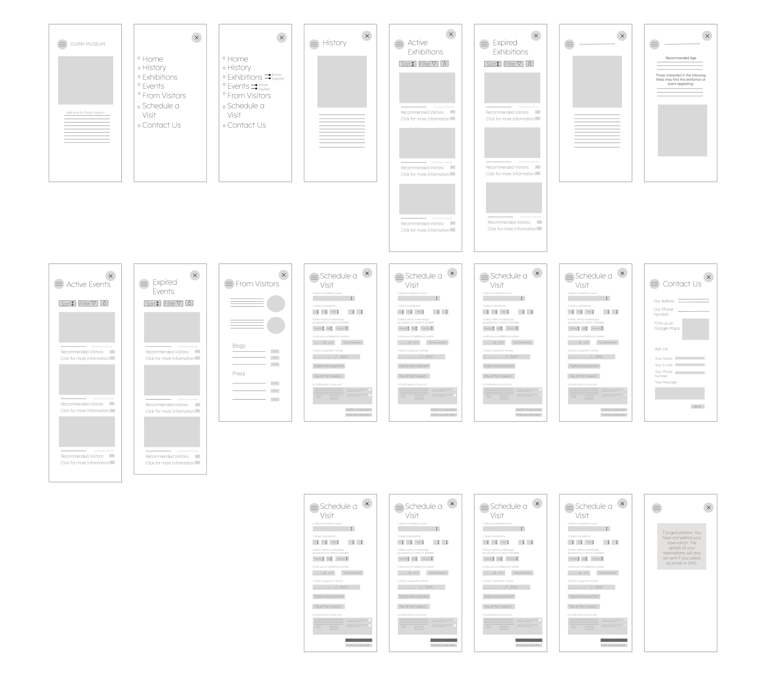
Prototypes
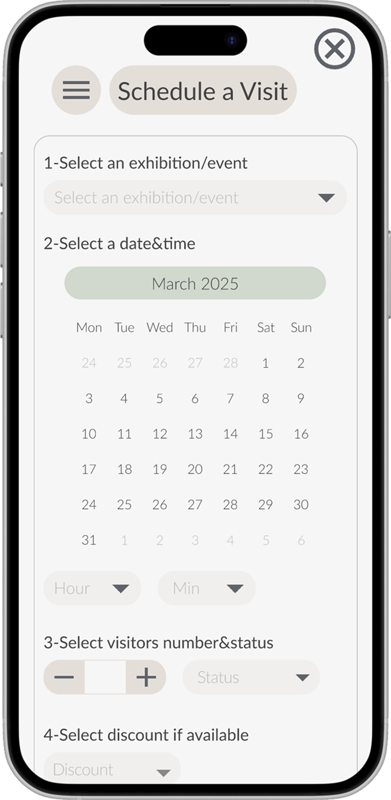
Paper and digital wireframes were transformed into an interactive prototype focused on core tasks such as browsing exhibitions, checking details, purchasing tickets, and organizing group visits. Key screens were connected to simulate real navigation, and the design was refined to improve clarity, hierarchy, and usability.
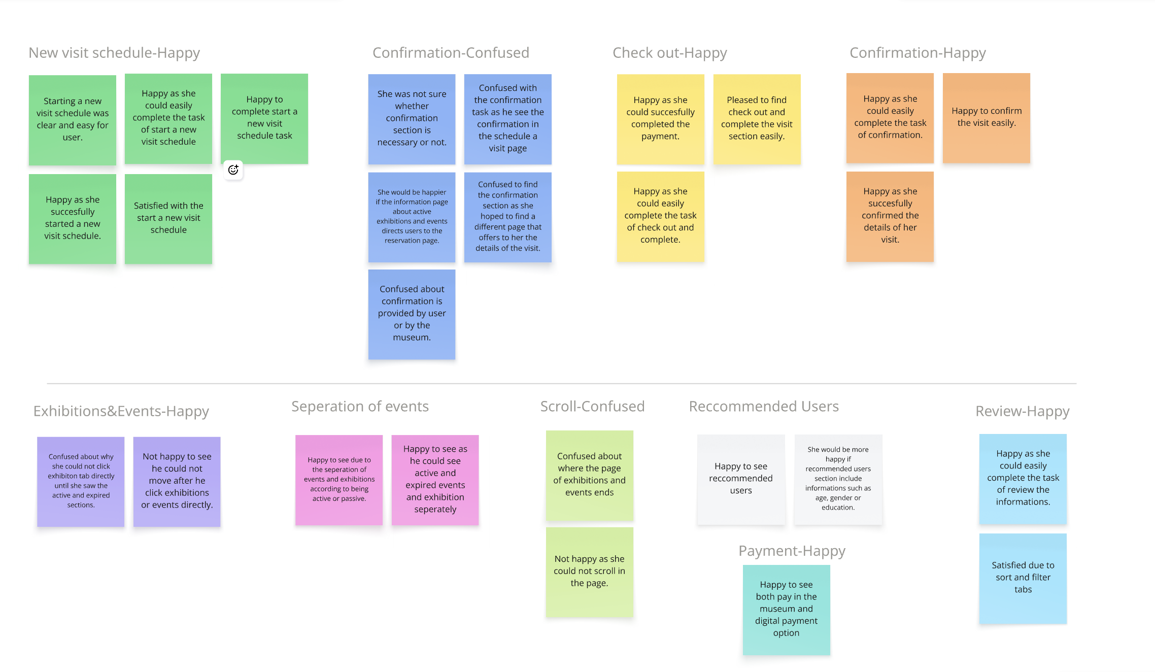
Usability study-Round 1
I conducted usability testing using a predefined task script and obtained consent from all participants. The study focused on evaluating task completion and the app’s learnability for new or infrequent users.
Results showed that users were generally satisfied with:
Scheduling visits
Checkout and payments
Reviewing information
However, usability issues emerged around:
The confirmation flow
Exhibition and event information structure
Recommended user guidance
Unclear page endings
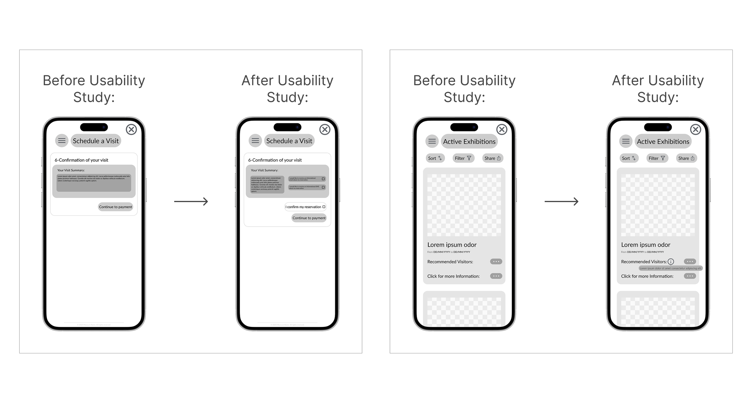
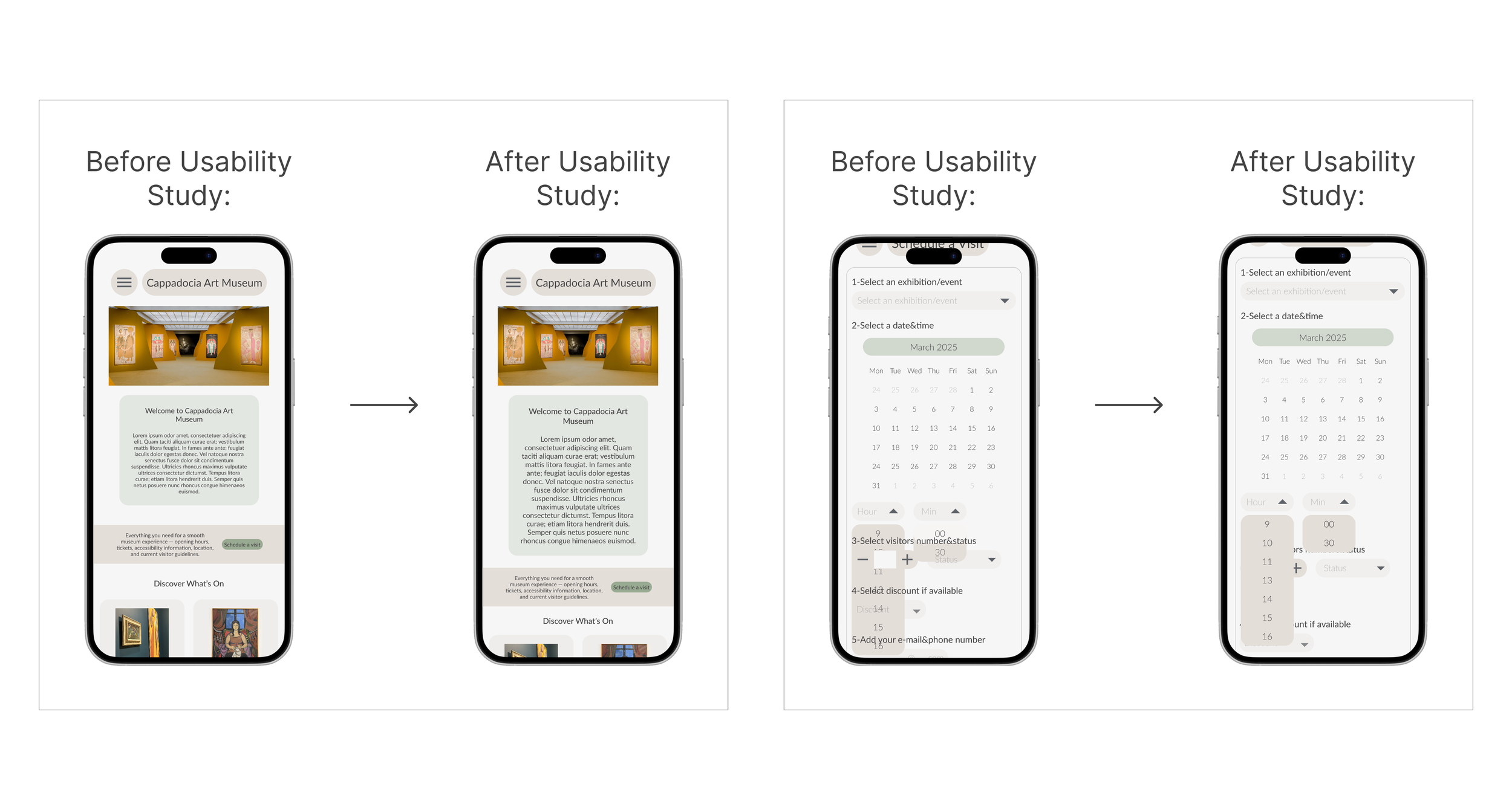
Changes Made After Usability Study
Based on usability findings, the task flow was simplified to improve clarity and continuity:
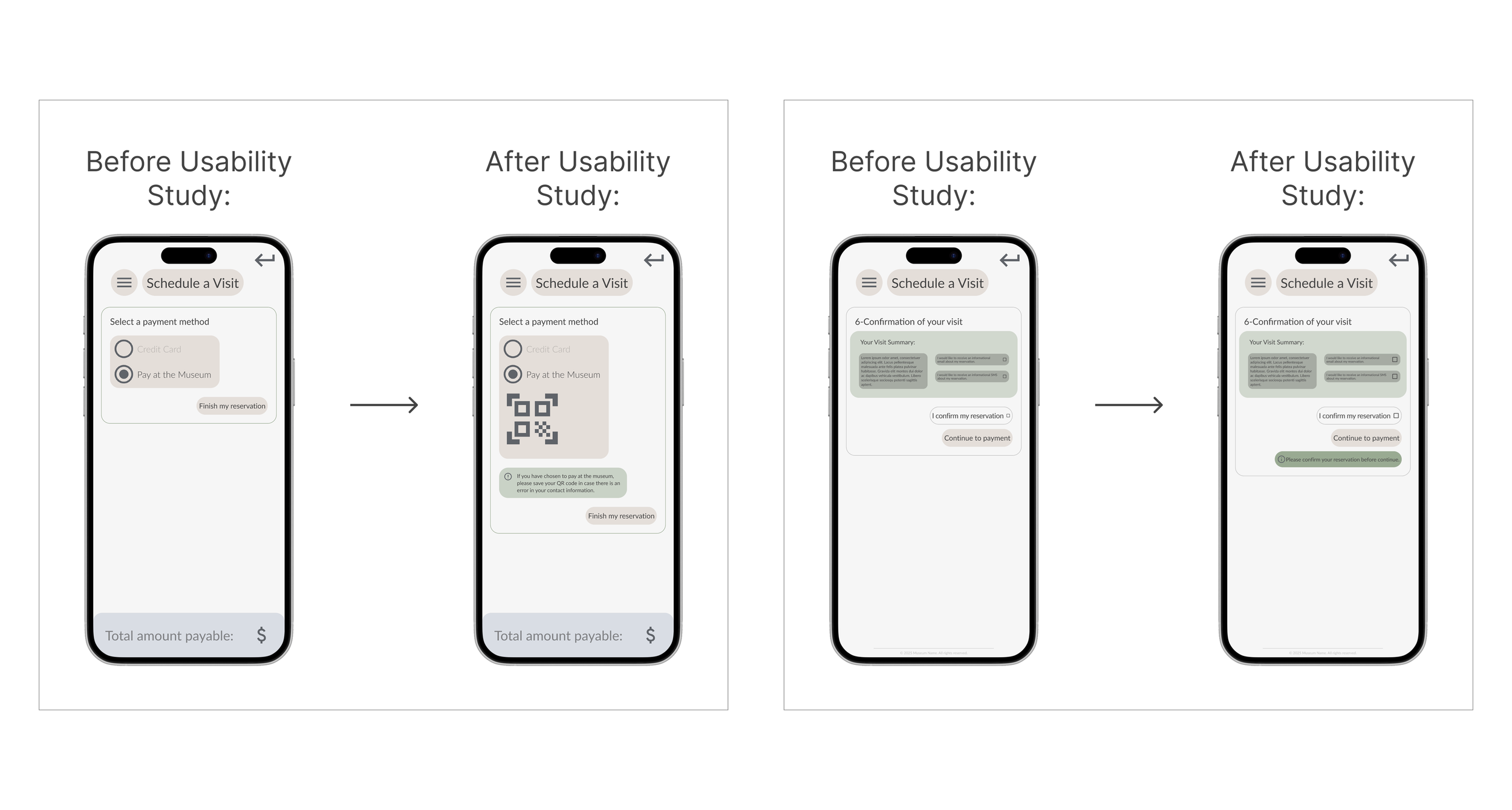
The confirmation process was clarified by adding email/SMS options, a required confirmation step, and a final confirmation page.
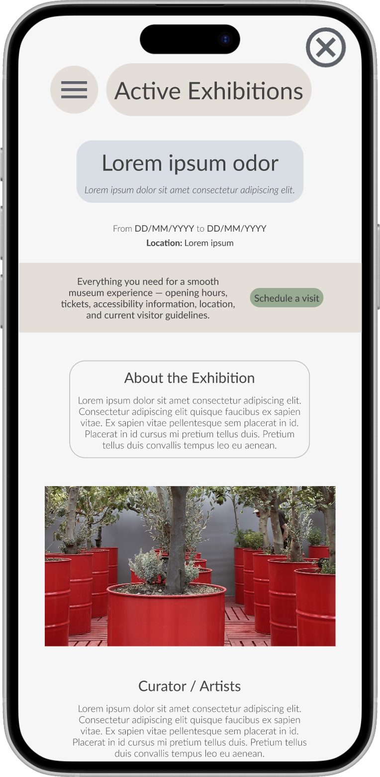
The flow for Exhibitions and Events was optimized to prevent confusion and allow smoother progression.
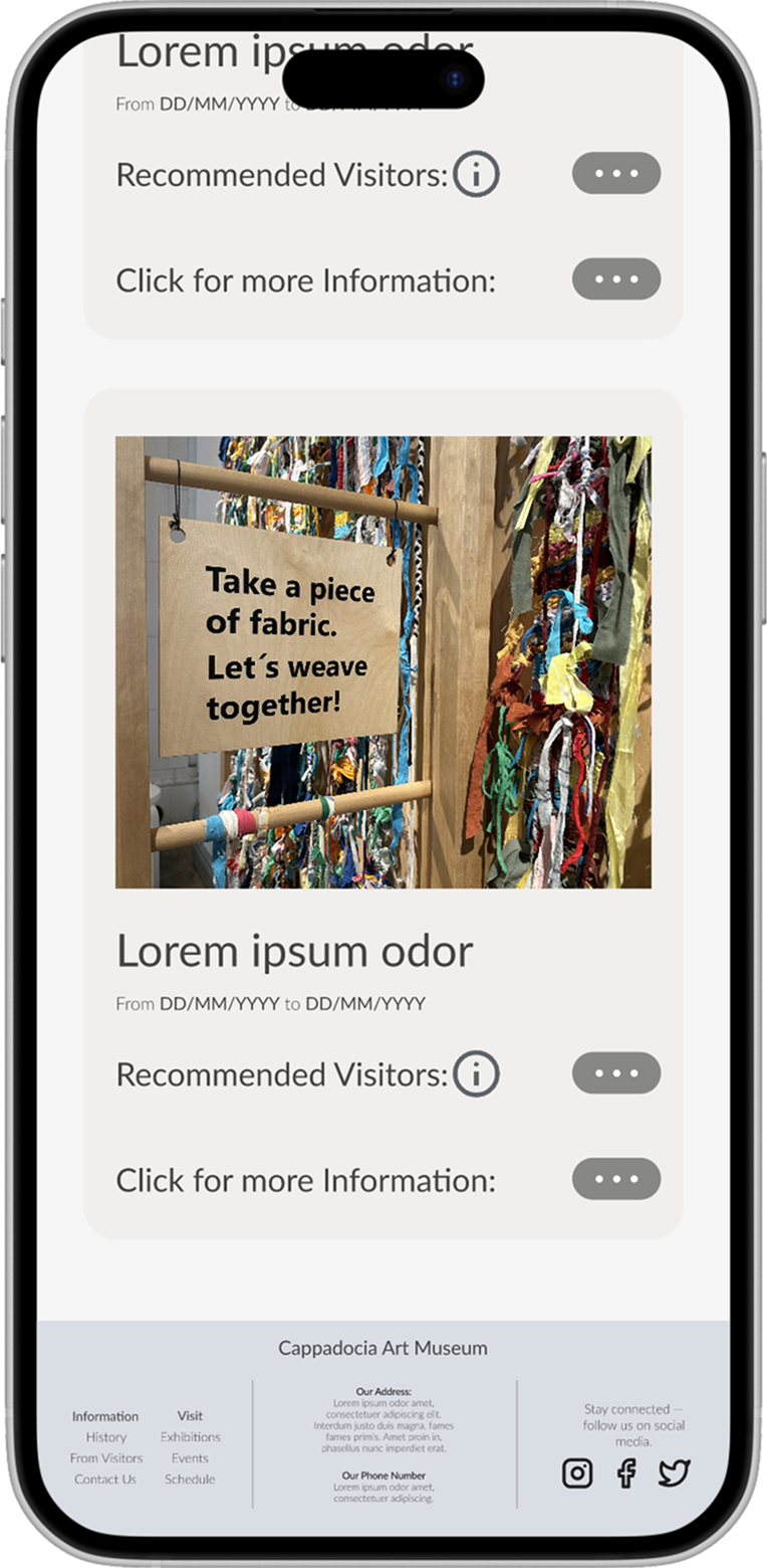
Information pages were refined by updating the footer to provide clearer end points and actionable guidance for users.
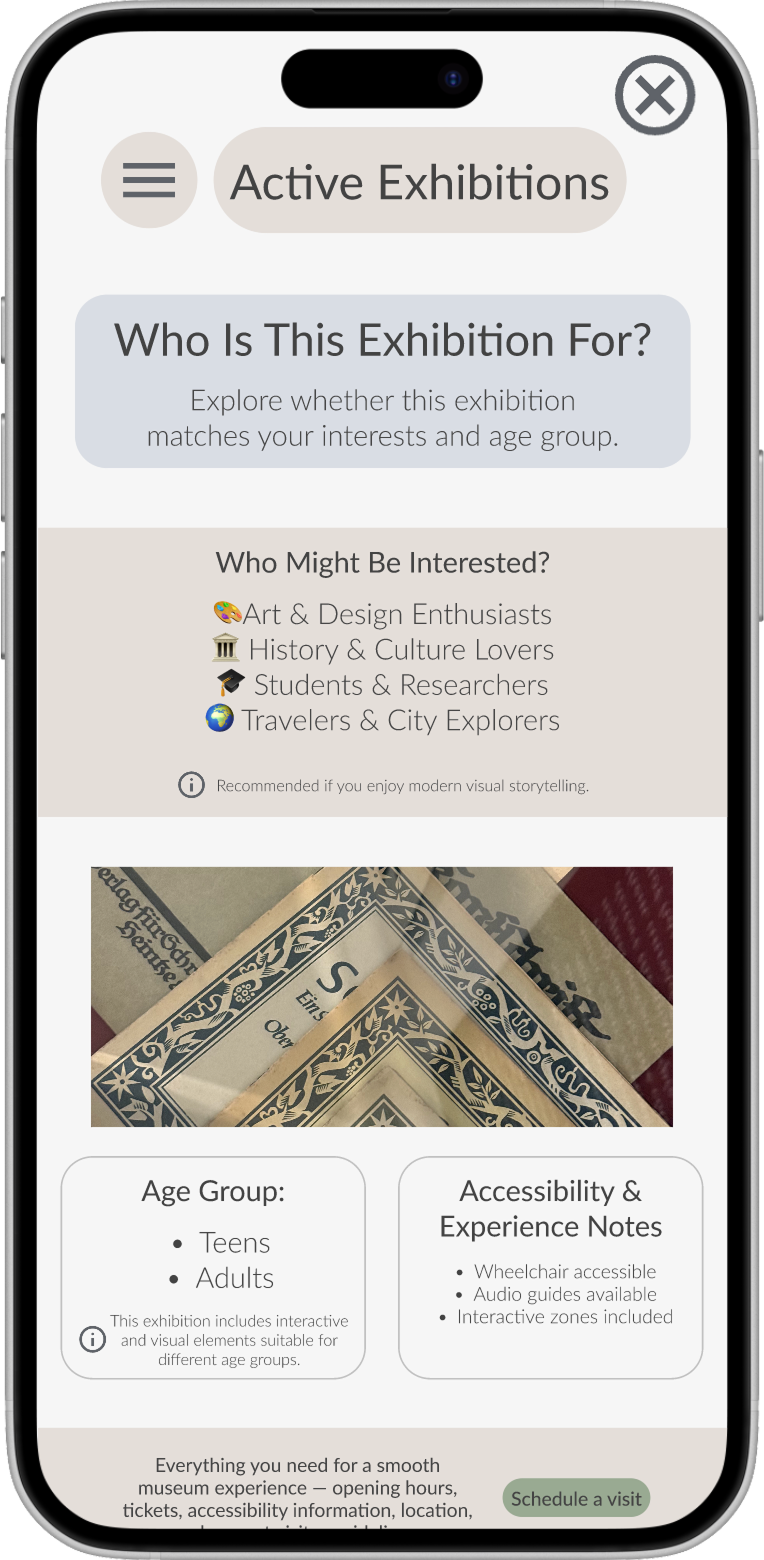
A short pre-information note was added within the Recommended Audience to clarify age suitability and interest areas.
Creating Mock-up and High-fidelity prototype
High-fidelity mockups were created to translate research insights into a clear and cohesive museum experience. The design focused on intuitive navigation, strong visual hierarchy, and well-structured content for exhibitions and events. Key user flows were refined to ensure clarity, consistency, and a seamless overall experience across the interface.
Usability Study – Round 2: Insights & Improvements
The second usability study focused on task completion and learnability, particularly for new and infrequent users. Using a structured testing script, key usability issues were identified and prioritized.
Based on user feedback, the following improvements were made:
•Added a dedicated credit card input field
•Increased button and checkbox sizes on confirmation and active/expired exhibitions and events areas
•Improved text readability on the homepage and history pages
•Progression was blocked and a warning was shown when confirmation was missing.
•Introduced a QR code fallback when contact information is missing
•Enhanced dropdown behavior and visibility for smoother interactions
These changes improved clarity, accessibility, and overall usability across the museum experience.
Conclusion
This project strengthened both my strategic thinking and practical UX skills by grounding design decisions in real user needs and measurable feedback.
It enabled me to frame the museum experience as a plan-ahead, stress-free digital journey while gaining hands-on experience with the end-to-end UX process. Two rounds of usability testing revealed critical pain points in information access, timeline clarity, ticket purchasing, and understanding next steps.
I recognized that the pre-visit experience is as important as the on-site visit. Simplifying flows, improving feedback, and making small, evidence-based refinements significantly increased learnability, user confidence, and overall usability.
The project reinforced that effective UX prioritizes clarity, predictability, accessibility, and low-effort decision-making over visual complexity, and strengthened my ability to translate research insights into clear, user-centered design solutions.