
Cappadocia Art Museum
UX Research | UX Design
Introduction
This project involves designing a responsive website for a fictional public art museum as part of the Build Dynamic User Interfaces (UI) for Websites course.
My main responsibility was creating a responsive website, starting my second portfolio project based on a prompt from an earlier course and focusing on clear, adaptable layouts that support exhibition discovery, ticket purchasing, and visit planning across devices.
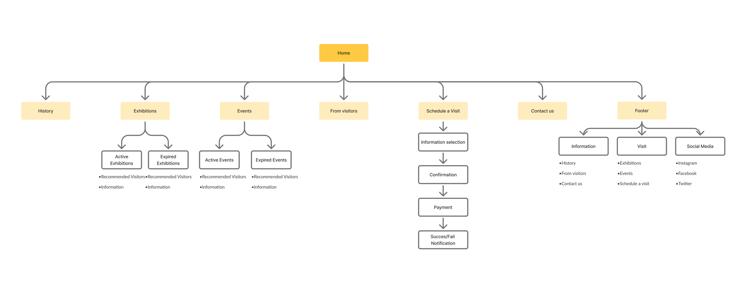
Planning Information Architecture
The sitemap was created by revisiting earlier user research, including personas and user journeys, to ensure the navigation reflected real user needs and behaviors. A hierarchical structure was chosen, starting with a clear homepage and expanding into main content categories and supporting subpages. This structure helps users efficiently explore exhibitions, access information, and complete key tasks such as ticket purchasing and visit planning.
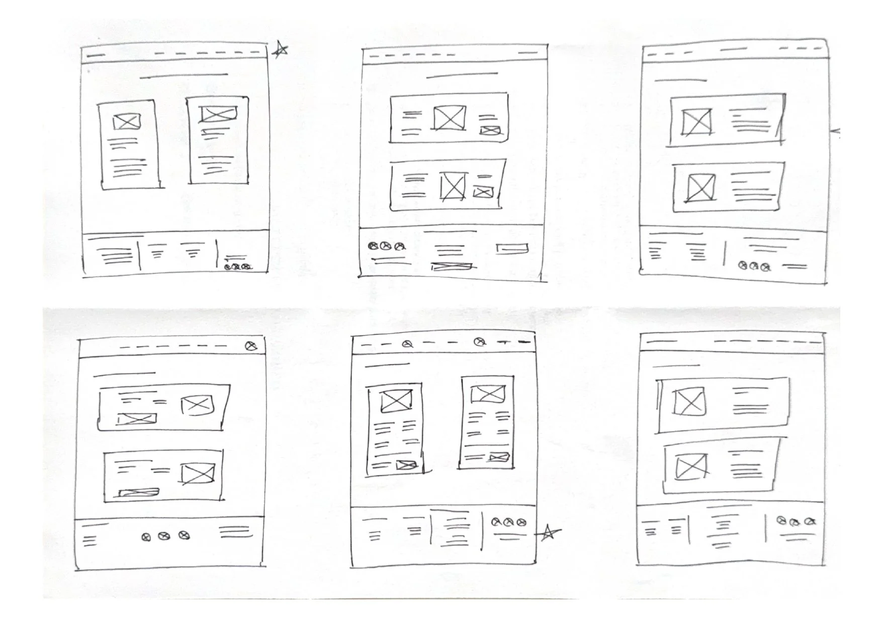
These paper wireframes were created specifically for the museum website project to explore how exhibition content, navigation, and supporting information adapt across screen sizes. Exhibition cards, the hamburger menu, and key CTAs were adapted across screen sizes to preserve content hierarchy, usability, and clear user actions before moving into digital wireframes.
Exploring Ideas and Sketches
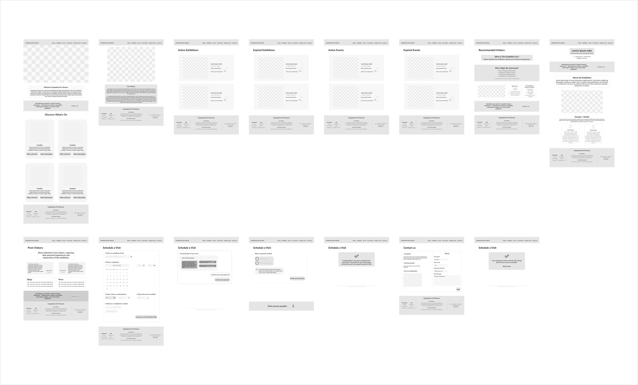
Paper wireframes were transformed into digital screens and developed into a low-fidelity prototype with clearly mapped user flows and entry points. Key interactions were connected across multiple screens to simulate forward and backward navigation. Navigation cues, primary actions, and alternative paths were clearly defined, with task completion states and logical return points integrated into each flow.
Low-fidelity Prototypes
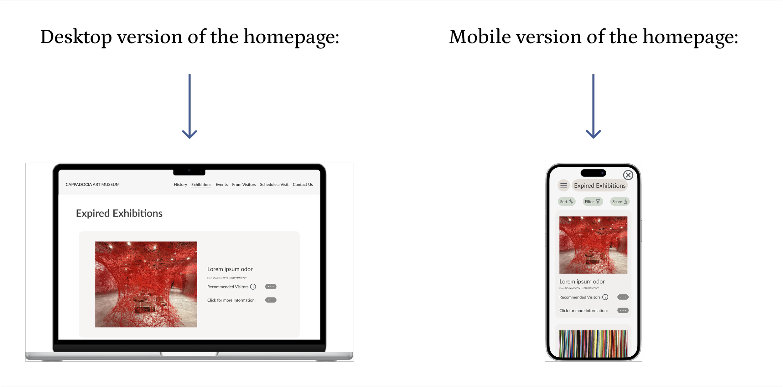
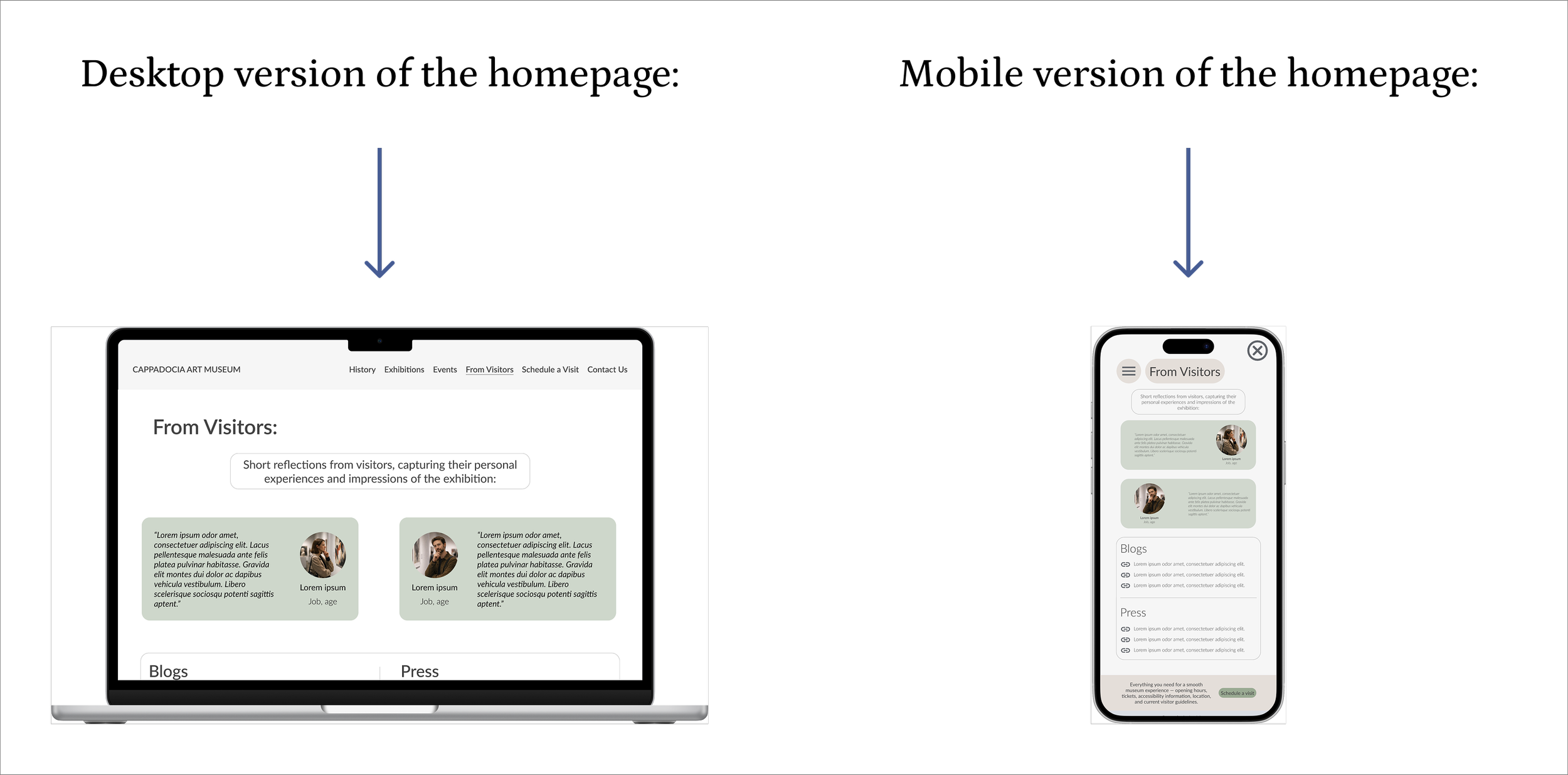
In this phase, I transformed wireframes into responsive high-fidelity mock-ups, refining visual hierarchy, layout systems, and interaction details to ensure a consistent experience across desktop and mobile devices.
Creating Mock-ups and High-fidelity prototypes
Usability Study: Insights & Improvements
A usability study was conducted with real users using a predetermined script and formal consent. The study focused on task completion and learnability, especially for new or infrequent users. Key findings highlighted the need for improvements in:
Content readability at different viewing distances
Smoother dropdown interactions
A clearer and more accessible credit card payment flow layout
Based on usability study insights, the following task-flow improvements were implemented:
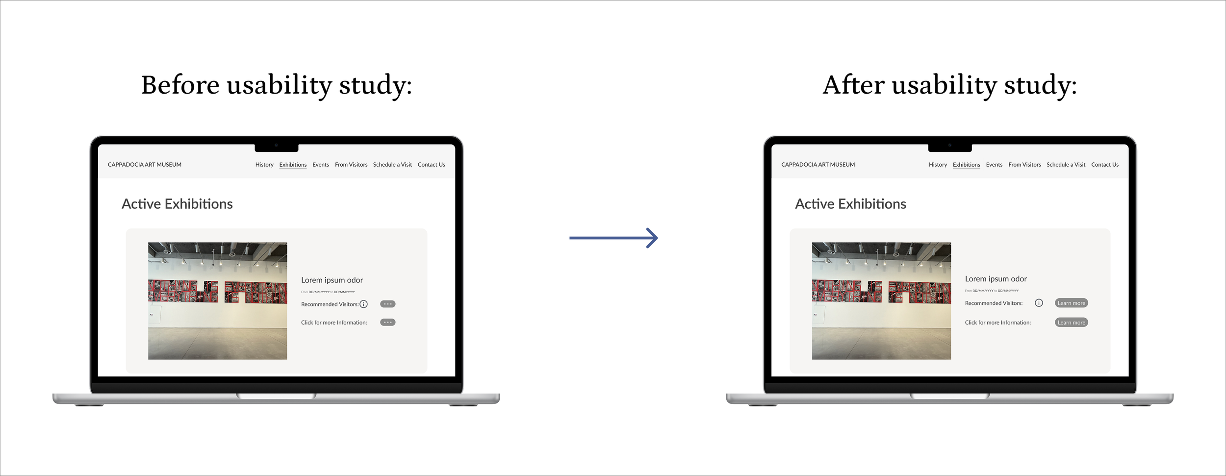
Text-based interactions were replaced with clear CTA buttons to make key exhibition details faster and more intuitive to access.
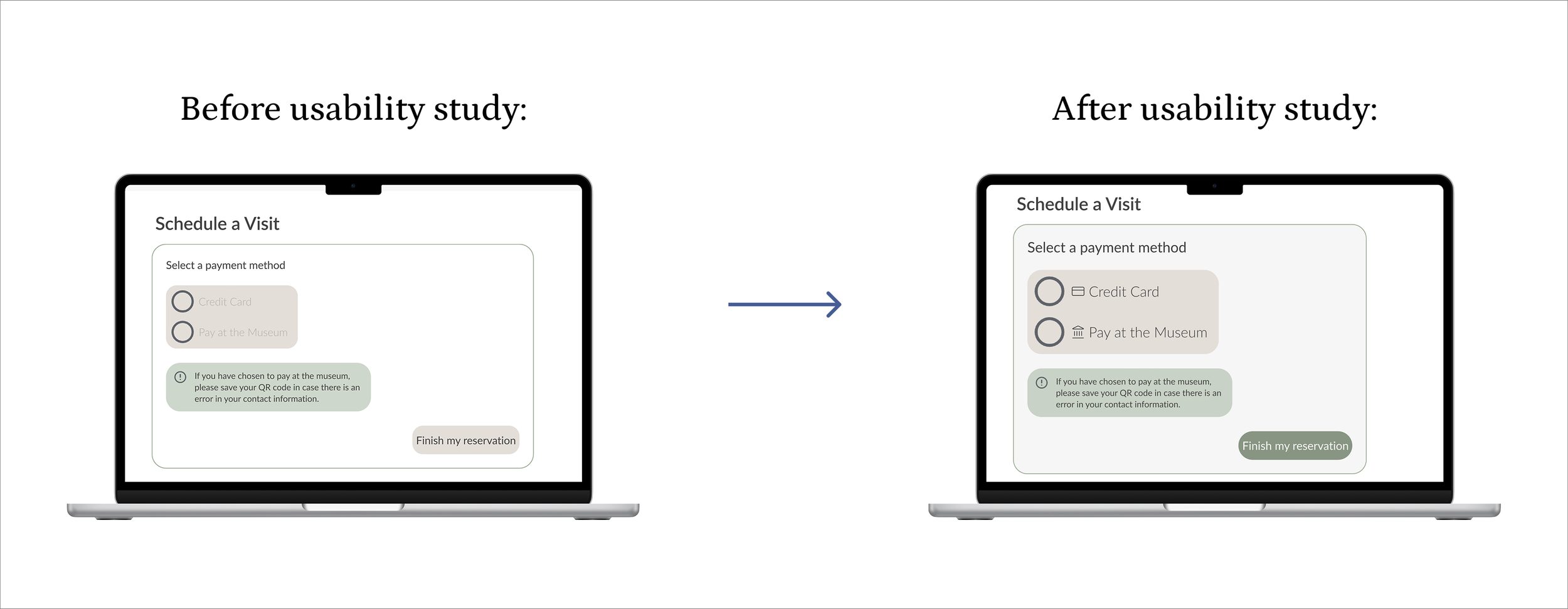
To improve task completion, the payment step was redesigned to clearly separate options and highlight the primary action, reducing hesitation and increasing user confidence before submission.
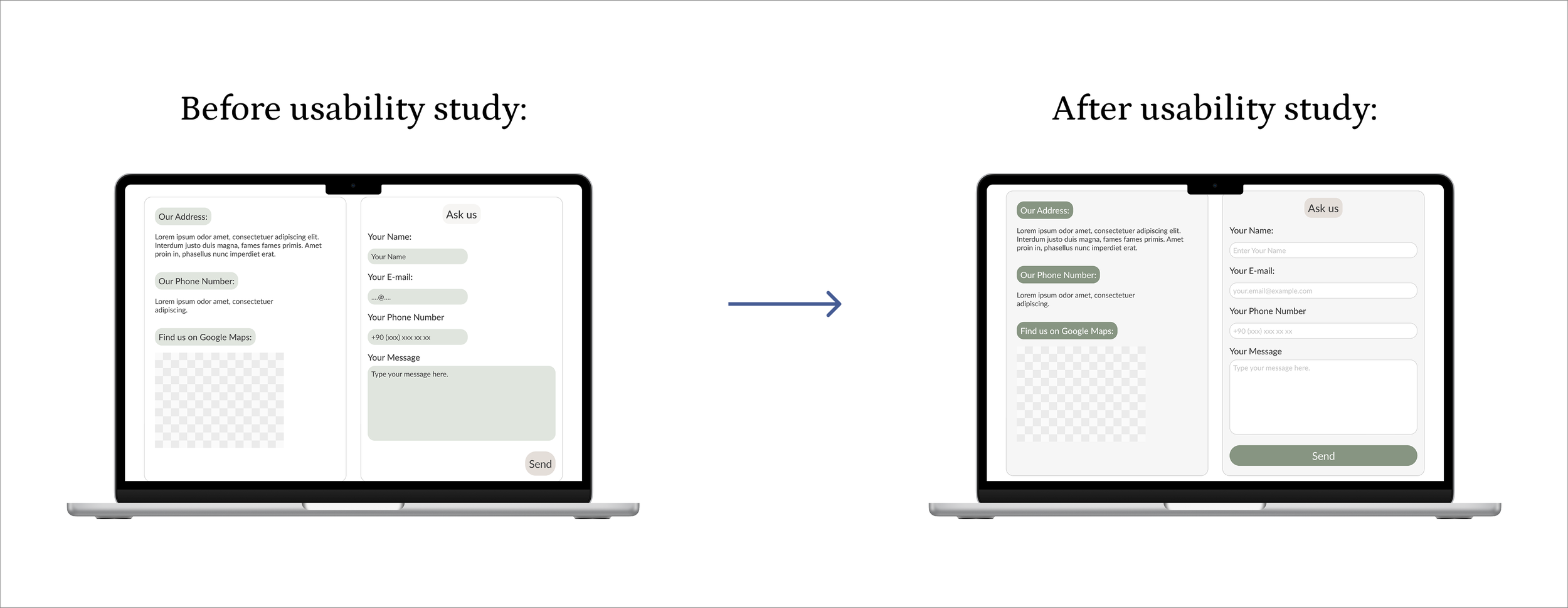
The contact page was redesigned to improve form clarity and visual hierarchy, making contact details easier to scan and the primary action more prominent.
This project reflects how I ground design decisions in research, clarity, and iterative improvement.
Translated research insights into structured information architecture and responsive layouts that scale across devices.
Iteratively refined interfaces based on usability feedback.
Strengthened my ability to define clear task flows and prioritize primary actions.
Designed for learnability and user confidence when addressing complex, real-world UX problems.